LOADING LEVEL...
LOADING LEVEL...
DESIGN 11 / FALL 2025 / PRODUCT DESIGN
A retro-inspired prototype that helps users locate lost water bottles through calm, visual proximity feedback instead of stressful precision tracking.
ROLE
Product Designer (Student Project)
TOOLS
Figma, interactive prototyping, state-based flows
TIMELINE
Fall 2025
CONTEXT
Design 11: Visual Thinking / personal frustration turned product concept
01 / PROJECT OVERVIEW
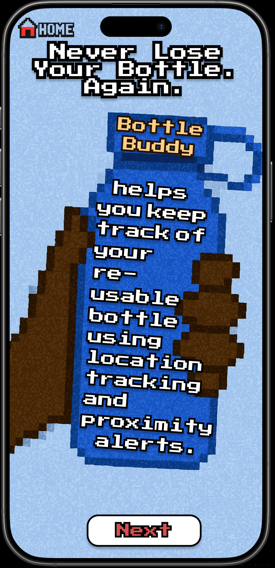
BottleBuddy is an interactive prototype designed to help users locate lost reusable water bottles in shared environments like dorms, classrooms, and dining halls. Instead of relying on exact coordinates, the system communicates proximity through calm, 8-bit visual feedback.
The project was inspired by a simple but recurring frustration: losing my bottle and wasting time retracing my steps. I wanted to design something that felt more supportive and less stressful than a typical tracking interface, especially in those short moments where you know an item is probably nearby but cannot immediately find it.
02 / THE PROBLEM
Students frequently misplace reusable water bottles in shared, high-traffic campus spaces. Existing solutions often lean heavily on notifications or exact tracking, but in real life that can feel unreliable, overwhelming, or unnecessarily stressful when the object is close but not visible.
In those situations, users usually need reassurance and directional guidance more than exact coordinates. The design challenge became: how might a system reduce anxiety and help someone search confidently without making them decode overly technical information?
03 / USERS + CONSTRAINTS
BottleBuddy was designed for college students moving through shared campus environments like Stanford dorms, classrooms, and dining halls. These are spaces where search moments are brief, uncertain, and usually happen while people are distracted or rushing between things.
The prototype was also shaped by practical constraints. Because this was built as a Figma-only concept without Bluetooth hardware, location data was treated as relative rather than exact. That pushed the system toward directional guidance instead of false precision, which honestly ended up strengthening the overall interaction model.
04 / DESIGN APPROACH
This project came out of a Design 11 prompt to design around something personally frustrating. I started with the experience of repeatedly losing my bottle, then reframed the problem around emotional needs during search: reassurance, clarity, momentum, and low cognitive load.
Using Figma, I designed a state-based prototype that translated uncertainty into understandable feedback. Rather than displaying exact distance, the interface tells users whether they are getting closer or farther away. That makes the product feel more like a guide than a tracker.
The visual language was inspired by retro games like Super Mario World and The Legend of Zelda. That influence helped me make the experience feel playful and exploratory without becoming cluttered or confusing.
05 / HARD SKILLS
06 / SOFT SKILLS
07 / KEY INTERACTIONS
BottleBuddy was built around a small set of states that guide users through uncertainty. Each screen is doing a slightly different job: setting expectations, reinforcing confidence, or helping users make progress without overthinking.
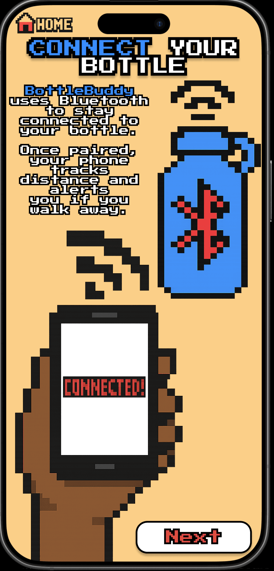
Introduces BottleBuddy as a calm, supportive companion and sets expectations around proximity-based guidance rather than perfect tracking.
Confirms the bottle is paired and ready, giving users confidence that the system is active before they need it.
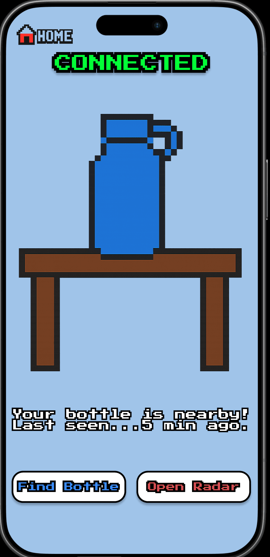
Acts as a reassurance checkpoint by showing that the bottle is nearby and offering simple next actions.
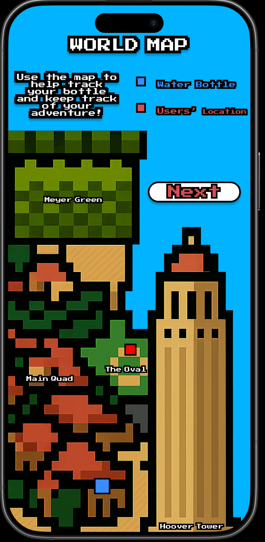
Provides contextual awareness through a simplified campus view that helps users mentally retrace their steps.
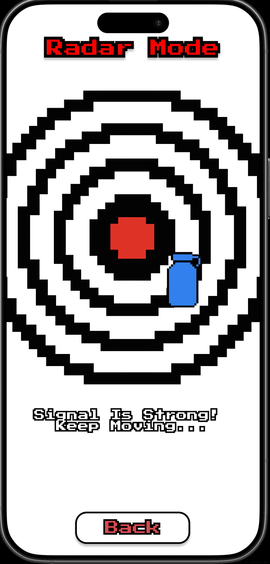
Uses progressive visual feedback instead of distance numbers, helping users tell whether they are getting warmer or colder.
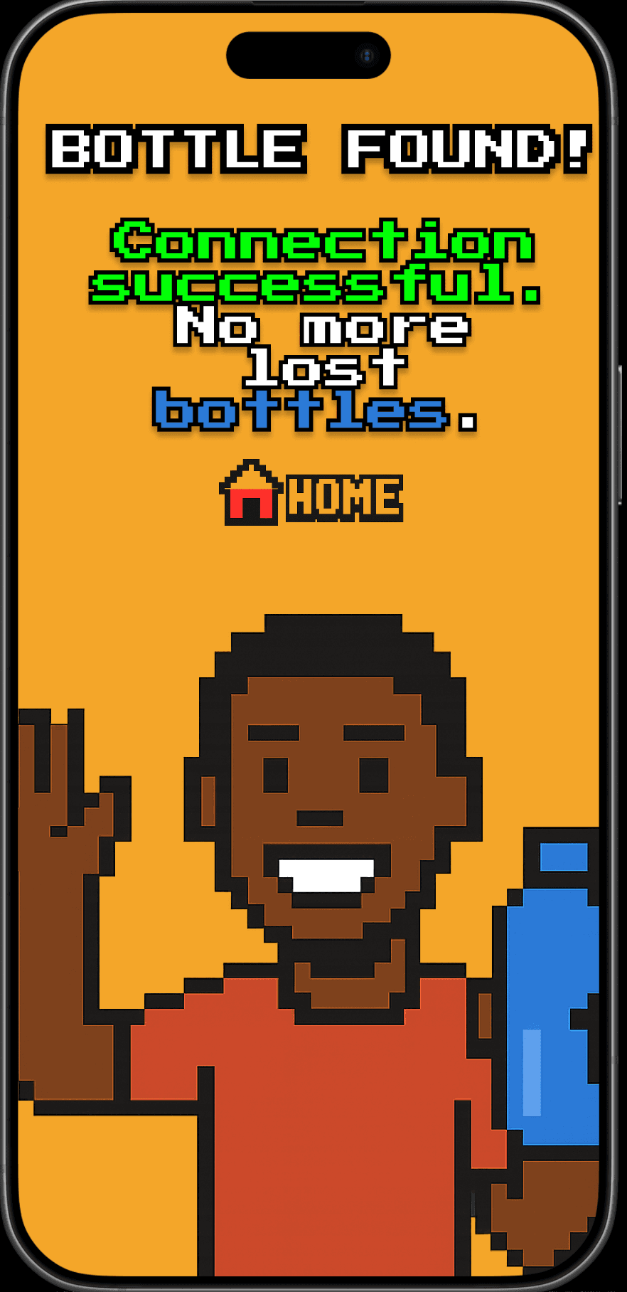
Closes the interaction with celebratory feedback, turning a frustrating moment into a satisfying one.
08 / WHY THE INTERACTIONS WORK
The biggest design decision in BottleBuddy was avoiding false precision. Rather than pretending the system knew an exact location, I focused on feedback that felt directional, legible, and low-pressure. That made the experience more honest and more usable at the same time.
The retro visual language also helped reinforce that mindset. It made the product feel exploratory and encouraging, which fit the search experience much better than a surveillance-heavy or overly technical interface would have.
09 / TAKEAWAYS
BottleBuddy taught me a lot about designing systems around uncertainty. Not every product problem needs to be solved with more data or more precision. Sometimes the better move is to communicate ambiguity well and help users feel oriented enough to act.
It also pushed me to think more intentionally about interaction states. I was not just designing individual screens — I was designing how confidence changes over time as someone moves from frustration to clarity. That is probably my favorite part of the project.
10 / PROTOTYPE
This project was built as an interactive Figma prototype focused on flow, state transitions, and visual feedback.